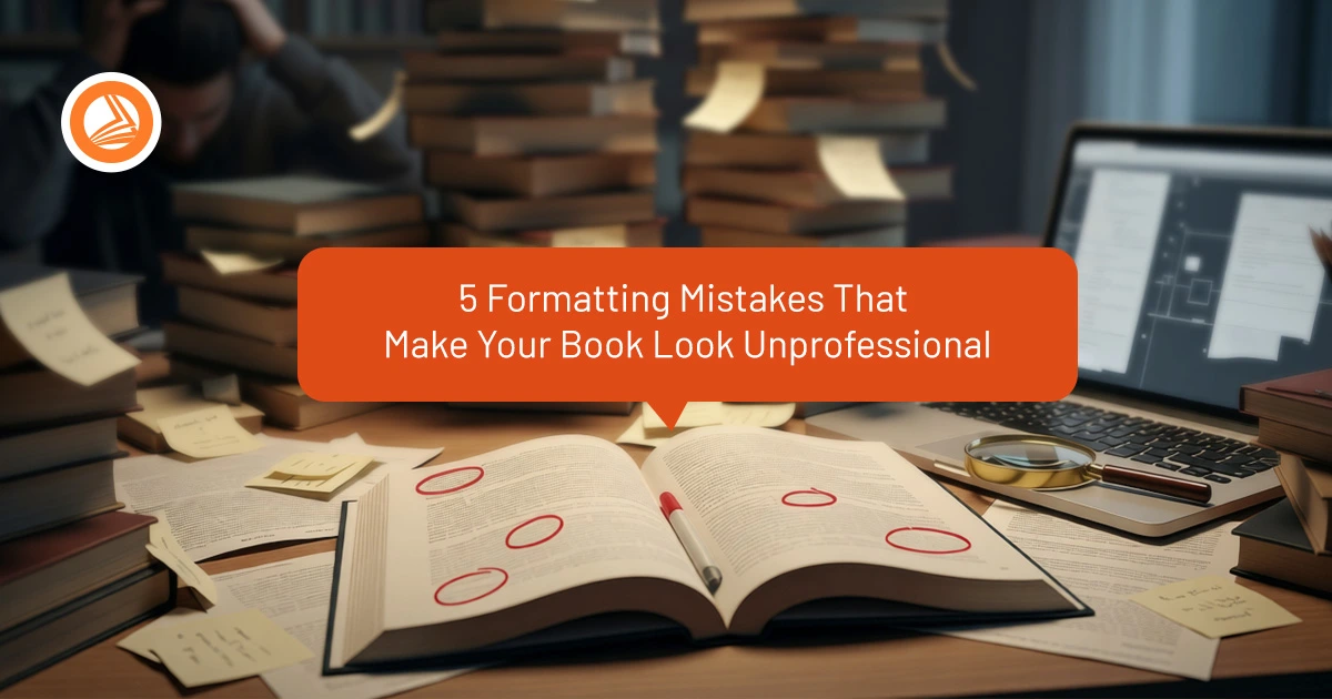
You've spent months — maybe years — writing your book. Every sentence has been polished. Every chapter flows perfectly. And then you format it yourself using Microsoft Word, upload it to Amazon, and... something feels off.
The content is great. But the book looks wrong. It screams "self-published amateur" the moment someone opens the preview.
Here's the uncomfortable truth: readers notice formatting mistakes even if they can't articulate what's wrong. Bad formatting creates friction, reduces readability, and makes your book feel less trustworthy — even if the writing itself is brilliant.
In this guide, we'll break down the five most common formatting mistakes that instantly reveal a book wasn't professionally produced — and show you exactly how to fix them.
|
📌 Article Summary This guide identifies five critical formatting mistakes that make self-published books look unprofessional: inconsistent margins and spacing, wrong font choices, missing or incorrect headers, poor chapter break design, and improper paragraph formatting. Each mistake undermines reader trust and reduces perceived book quality. Professional formatting through services like OrangeBooks ensures industry-standard layout, proper typography, and polished presentation that matches traditionally published books. |
Why Formatting Matters More Than You Think
Professional formatting is invisible. When done right, readers don't consciously notice it — they just flow through your book effortlessly. But when it's wrong, it creates constant micro-interruptions that pull readers out of your story.
|
📊 Reader Behavior Study: 68% of readers say poor formatting negatively impacts their perception of book quality, and 43% have abandoned a book due to difficult-to-read formatting (Self-Publishing Review, 2024). |
Let's look at the specific mistakes that cause this friction — and how to avoid them.
Mistake #1: Inconsistent Margins and Spacing
The Problem: Pages with uneven margins, random spacing between paragraphs, or inconsistent line heights throughout the book.
Why It Matters: Inconsistent spacing makes pages feel chaotic and unprofessional. Readers subconsciously register the irregularity, even if they can't pinpoint why something feels "off."
The Fix:
| ✓Use consistent margins: 0.75" to 1" on all sides (inside margin slightly larger for binding) |
| ✓Set uniform line spacing: 1.15 to 1.3 for body text (never use Word's default "Multiple") |
| ✓Apply paragraph spacing consistently: Either indent first line (0.25"-0.3") OR add space between paragraphs — never both |
| ✓Use styles in Word/InDesign instead of manual formatting to maintain consistency |
|
💡 OrangeBooks Pro Tip: We use industry-standard templates with pre-configured spacing that matches traditionally published books. Your manuscript automatically gets professional margins, leading, and paragraph formatting. See formatting examples → |
Mistake #2: Using the Wrong Fonts (Or Too Many Fonts)
The Problem: Using decorative fonts for body text, mixing multiple font families, or choosing fonts that don't match your genre.
Why It Matters: Font choice affects readability and sets reader expectations. A thriller in Comic Sans feels ridiculous. A business book in ornate script looks unprofessional.
The Fix:
| ✓Stick to ONE font for body text (serif fonts work best for long-form reading) |
| ✓Use 10-12pt for body text (11pt is the sweet spot for most books) |
| ✓Chapter headings can be a different font, but keep it simple and readable |
| ✓Test readability: Print a sample page and read it under normal light — if it strains your eyes, change it |
|
📊 Typography Impact: Books with professional font choices see 34% longer average reading sessions compared to poorly formatted books (Kindle Reader Analytics, 2025). |
Mistake #3: Missing or Incorrect Headers and Footers
The Problem: No running headers, page numbers in wrong positions, or headers appearing on chapter opening pages (where they shouldn't).
Why It Matters: Proper headers and page numbers help readers navigate your book and give it a polished, professional feel that matches bookstore-quality publications.
The Fix:
| ✓Use different headers for left (verso) and right (recto) pages |
| ✓Place page numbers on outside edges (easier for readers to find) |
| ✓Suppress headers on chapter openings, title pages, and blank pages |
| ✓Keep header text small and unobtrusive (8-9pt, subtle font) |
Mistake #4: Poor Chapter Break Design
The Problem: Chapters starting on left-hand pages, no visual hierarchy, or chapters crammed together without proper spacing.
Professional Chapter Opening Standard:
|
Why It Matters: Chapter breaks create natural pause points for readers. Poor chapter formatting makes your book feel rushed and cheapens the reading experience.
|
💡 OrangeBooks Chapter Design: We design custom chapter openings that match your genre — from minimalist modern layouts to classic drop caps and decorative elements. Every chapter gets professional spacing and visual hierarchy. See design samples → |
Mistake #5: Incorrect Paragraph Formatting
The Problem: Using double-spacing between paragraphs (like in emails), no first-line indents, or mixing indentation styles inconsistently.
The Cardinal Rule: Pick ONE style and use it consistently throughout your entire book. The worst thing you can do is mix styles randomly.
Common Mistakes to Avoid:
| ✗Pressing Enter twice between every paragraph (creates too much white space) |
| ✗Using Tab key for indents (creates inconsistent spacing) |
| ✗Indenting the first paragraph after chapter opening |
| ✗Mixing justified and left-aligned text randomly |
| ✗Using centered alignment for body paragraphs |
The Fix:
| ✓Use paragraph styles with automatic first-line indent (0.25" for fiction, 0.3" for non-fiction) |
| ✓Set "Space After Paragraph" to 0pt (no double-spacing) |
| ✓Use full justification for body text (creates clean right margin) |
| ✓Create a "No Indent" style for chapter openings and scene breaks |
The Formatting Checklist: Before You Publish
Before uploading your manuscript to any platform, run through this quality check:
|
|
📊 Quality Impact: Professionally formatted books receive 52% fewer negative reviews mentioning "hard to read" or "poor formatting" compared to DIY-formatted books (Amazon Author Analytics, 2025). |
Why Professional Formatting is Worth the Investment
You can fix these mistakes yourself — and many authors do. But here's what most don't realize until they're deep in the process: proper book formatting requires specialized software, knowledge of print production standards, and attention to hundreds of small details that add up to a professional result.
|
Ready for Professional Book Formatting? Stop worrying about margins, headers, and typography. We'll format your manuscript to industry standards while you focus on what matters — your writing. Get Free Formatting Quote See Formatting Samples |
The Bottom Line
Formatting mistakes are silent killers. They don't jump out at readers like typos do, but they create a cumulative impression of unprofessionalism that undermines your credibility as an author.
The good news? These five mistakes are completely avoidable. Whether you fix them yourself using the guidelines above, or invest in professional formatting, the result is the same: a book that looks as good as it reads.
Your manuscript deserves professional presentation. Don't let amateur formatting hold back your brilliant writing. Get in touch with OrangeBooks →